


It is done, you have laid the groundwork to properly conceptualize your dashboard. You have identified the recurring need, the audience, the frequency, and you are ready to work as a team. Now, what to put in your dashboard?
Having worked with many companies, here are a few tips to follow when creating a dashboard.
Unfortunately, in many cases, the identification of indicators begins with a tedious brainstorming exercise where everyone goes through an exhaustive list. In fact, key performance indicators, as the name suggests, should be limited to what really matters to your organization. They are linked to the success and objectives of your organization or department. The rest should support these indicators and be able to help understand the performance of the key indicators.
Make sure you have a hierarchy of indicators that culminates with the famous key indicators. For example, in retail, gross sales could be a key performance indicator, but the number of transactions per customer, the average basket and the number of active customers could be explanatory metrics to support gross sales. In this way, if gross sales drop, we will know if it is due to a decrease in the number of customers, a decrease in transactions per customer or a decrease in the average basket.
Another reason why we may end up with a (too) long list of indicators is that we include the notion of dimension in our metrics. For example, if we have two metrics: gross online sales and gross in-store sales, there is one too many. In fact, we should have only one gross sales metric, but that we dig according to the sales channel (store vs. online dimensions). This allows us to design a dashboard that allows us to drill down to different dimensions while keeping the number of metrics limited. This also avoids having a dashboard that fits on several pages.
The important thing is that your key performance indicators are green and if they are not, you must be able to find an answer easily and quickly.
A key indicator without comparisons is not worth much. For example, for a given month, you have revenues of $5M, is that good? We often base the comparison across time: year over year, previous month, previous week… You can also have a comparison with an objective to reach or a projection that will have been established thanks to a predictive model for example. The important thing is to use the comparison that is relevant to your business context and that will allow you to quickly identify problems.
Do not neglect the appearance of your dashboards. In addition to presenting the right metrics, you need to present them well. Again here, keep it simple! Anything that is not necessary for high-level understanding of the data/graphs should be removed.
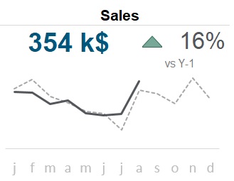
Here is a simple example of a key metric presented in a dashboard. It would show the sales of the last month (key metric), the year-over-year change with a visual indicator (comparative), and the trend of the last few months (long-term view). The graph and the data presented are kept as clean as possible, while revealing the essentials.
Need help creating your dashboard? See how we can help you.